
Howsafe
Navigation
Redesign.
A new mega menu, a tabbed mobile drawer, and the IA decisions behind them — built from your traffic and revenue data. Final artwork ready for review.
Navbar layout — three options for you to pick.
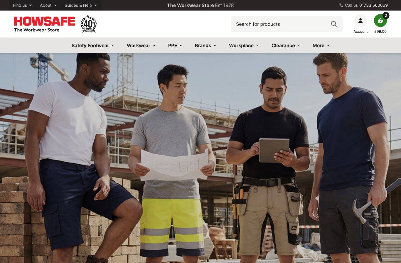
Logo and search left, navbar items left-aligned underneath. Familiar layout, follows reading order. Closest to the current site's structure.
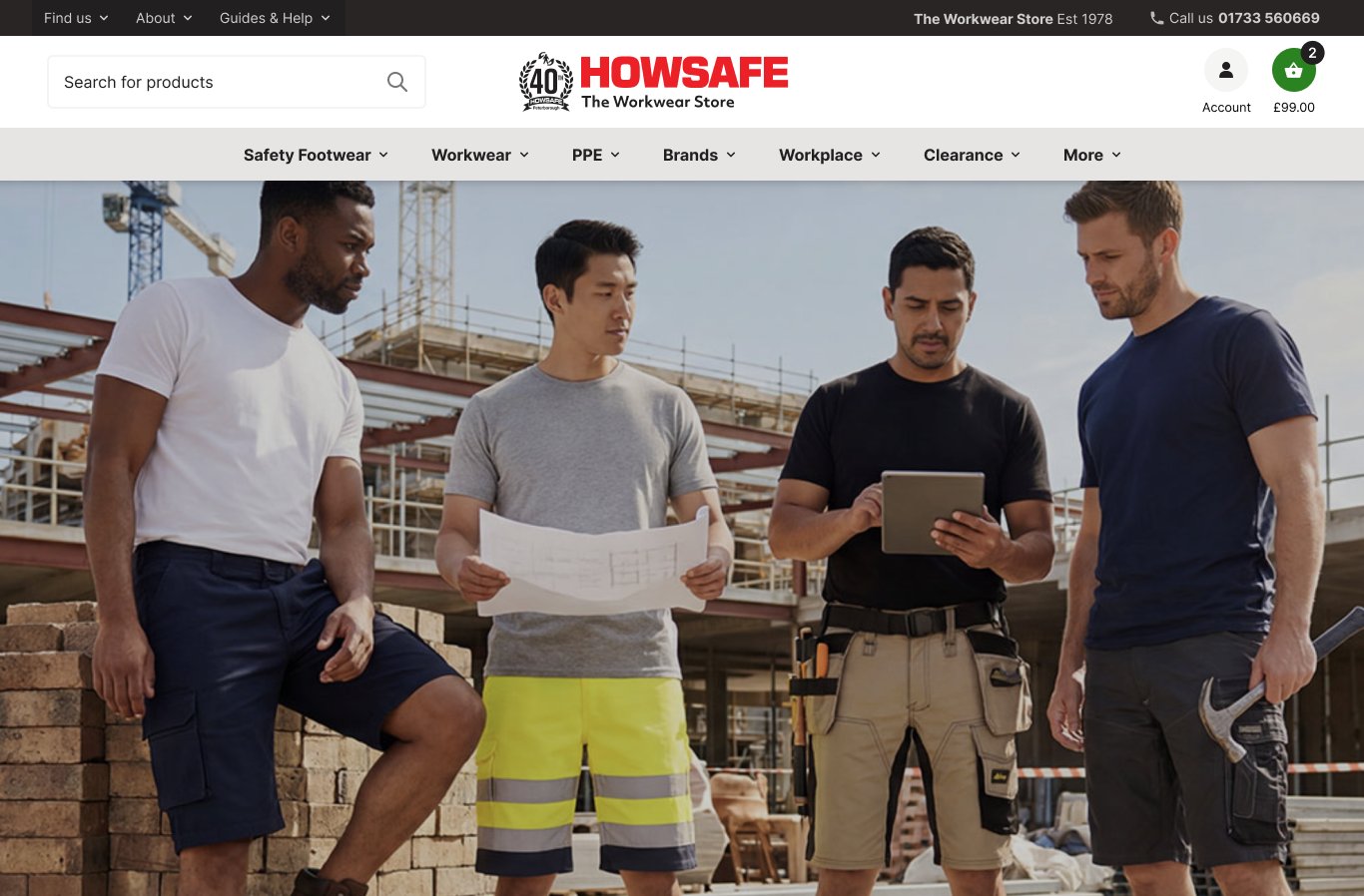
Logo centred, navbar centred underneath. More balanced and modern. Reads as a more retail-focused brand.
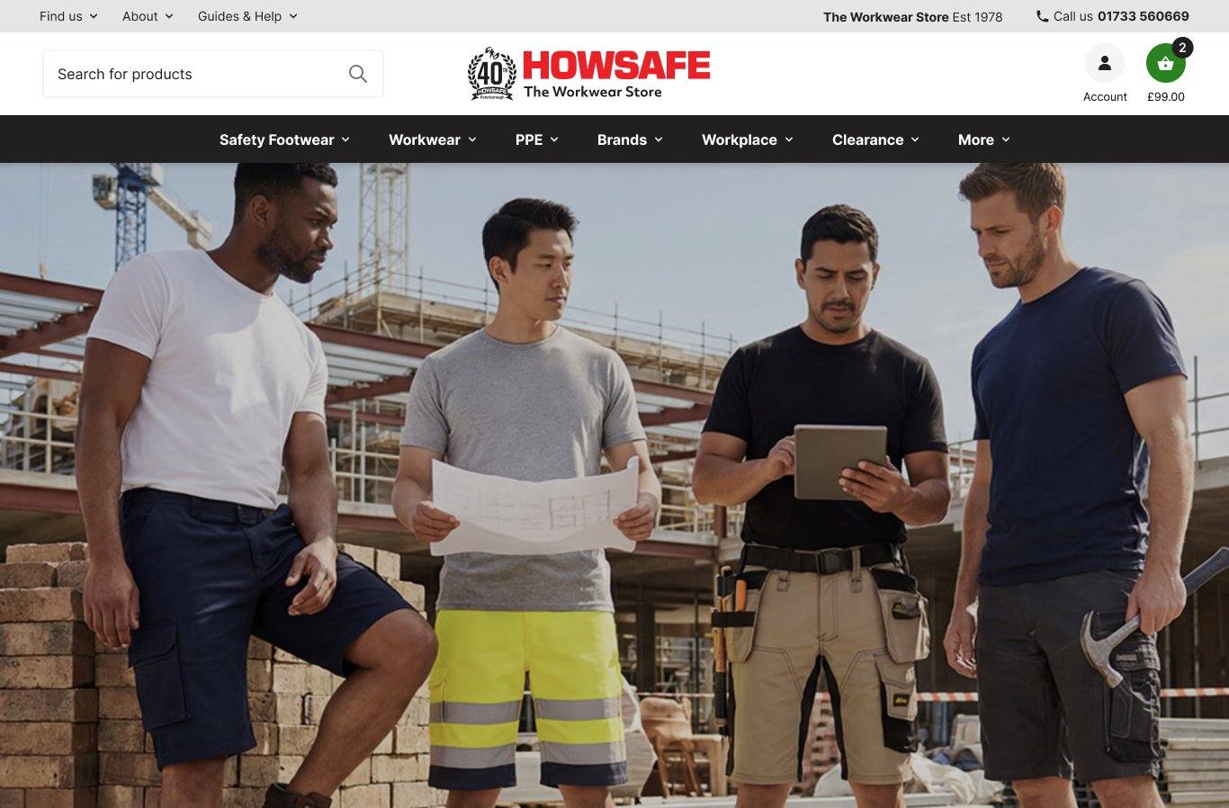
Same layout as Option 2 but the navbar bar itself is dark. Stronger visual anchor, the menu reads as a clear horizontal stripe.
From "Click to Shop" to a navigation that scales with your traffic.
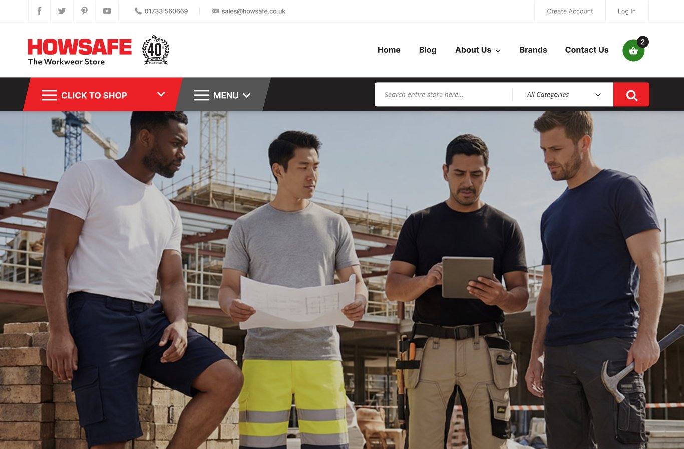
- "Click to Shop" hides all 3,500+ products behind one button
- Top-row navigation reads as marketing pages, not categories
- No way to see the structure of the catalogue at a glance

- Seven top-level categories visible immediately
- Mega menus surface sub-categories shaped by traffic data
- Brands surfaced as its own first-class menu, no longer buried
- Navbar chrome reduced from 222 px to 182 px — ~18% more vertical space for catalogue on every page
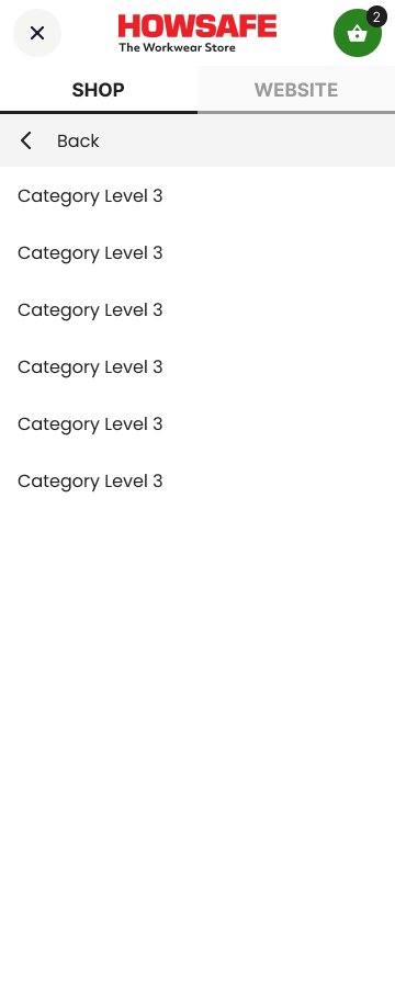
Mobile drawer — same IA, redesigned chrome, persistent account access.
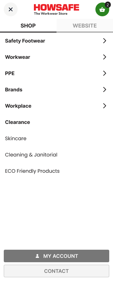
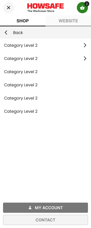
Mobile keeps what works, sharpens what doesn't.
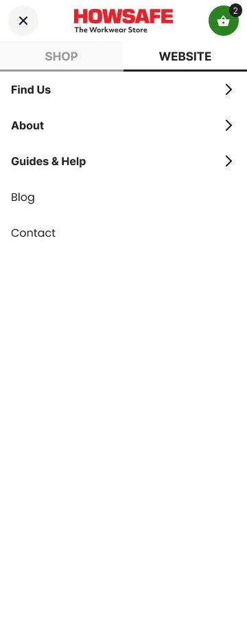
Website tab's contents now mirror the desktop top-bar flyouts (Find Us, About, Help & Guides). Anyone switching device finds the same content in the same place.
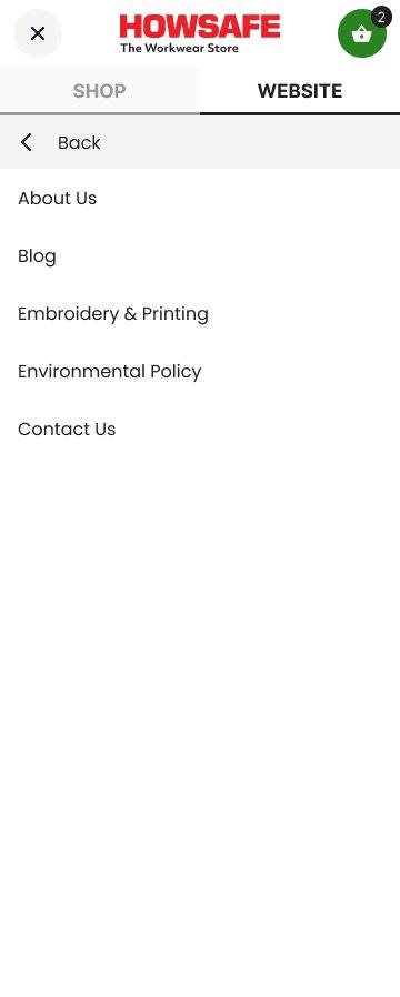
Three drill-down levels in Shop (L1 → L2 → L3) and two in Website. Active tab clearly indicated. Demoted categories visually de-emphasised.
Always accessible at the bottom of the drawer regardless of which tab or level — instead of being buried inside the Website tab.
~19% less mobile chrome, ~29 px more catalogue visible above the fold. Search bar, account and basket still persistent across all states. Cleaner header, larger tap targets.
Three flyouts, one phone number — non-shopping content lives up here.
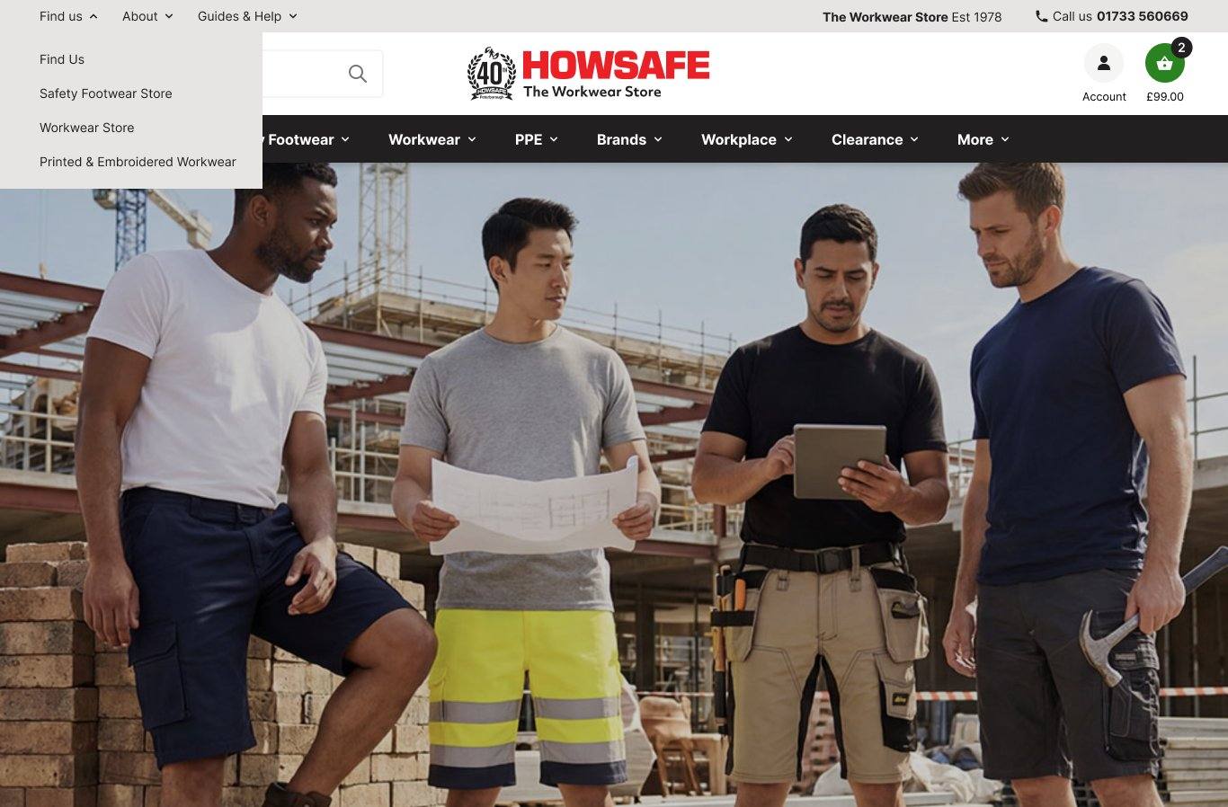
Workwear Store, Safety Footwear Store, Printed & Embroidered Workwear — local-SEO landing pages live here.
About Us, Embroidery & Printing, Environmental Policy, Blog, Contact Us. Anything "about Howsafe as a company".
Footwear Sizing, Standards, Toe Cap Guide, Industrial Work Gloves, DTF Printing for Events. Content marketing surfaces naturally.
Email and social icons removed from top bar — they live in the footer only. Cleaner.
Safety Footwear — your highest-traffic category, designed accordingly.
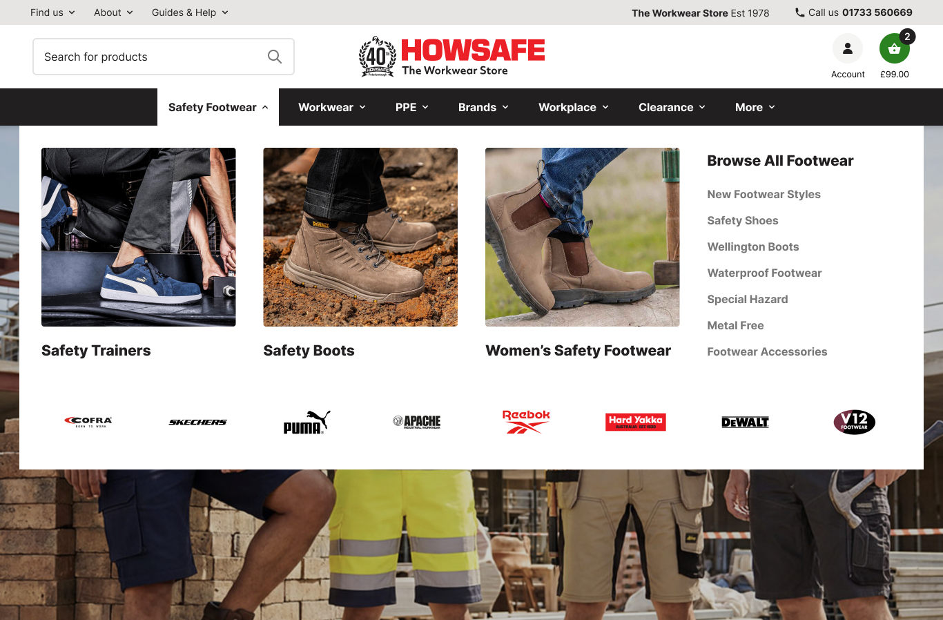
Three featured photo columns — Trainers, Boots, Women's — chosen because they're the top three traffic destinations by a clear margin.
Eight footwear brands ordered by revenue. Cofra leads at £7.9K.
Workwear — twelve sub-categories, three earn featured treatment.
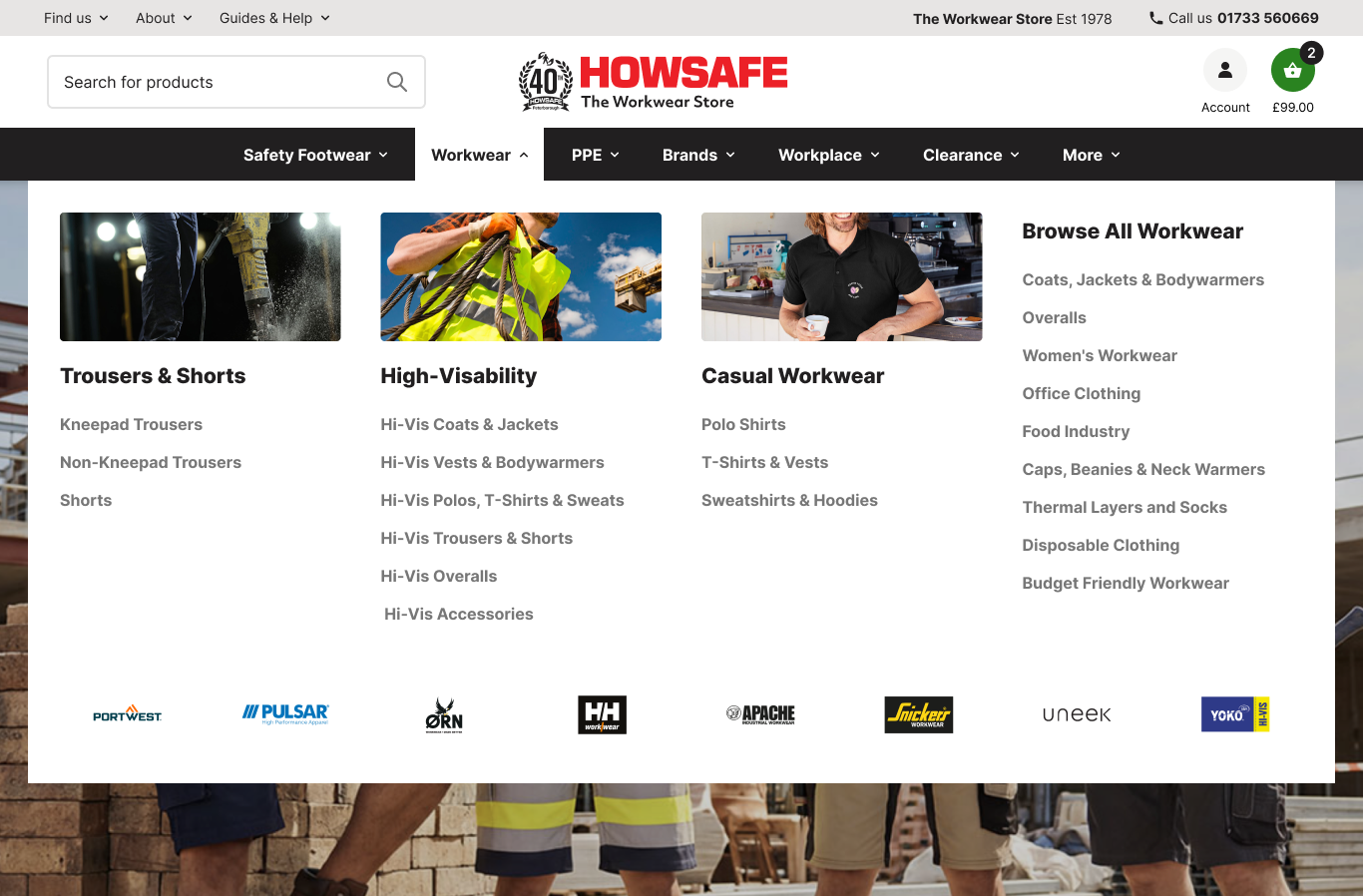
Trousers and Hi-Vis dominate workwear traffic. Each gets a featured photo column with sub-categories listed inline.
Different brands than Footwear. Portwest leads at £3.8K. Pulsar, Orn, Helly Hansen Workwear follow.
PPE Option A — text columns, fast to scan.
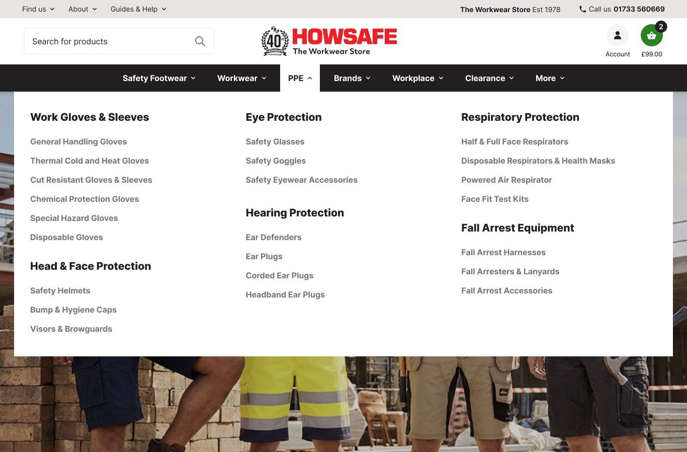
- All 22 sub-categories visible immediately
- Trade buyers reach sub-category in one click
- No photo curation required — low maintenance
- Translates cleanly to mobile accordion
- Less visual interest — text doing the work
- Newer customers may struggle to recognise category by name alone
PPE Option B — image tiles, faster recognition.
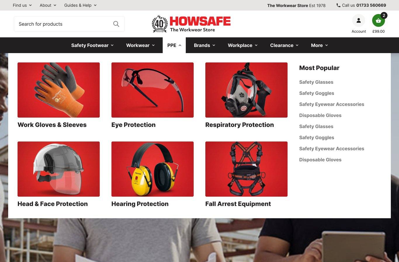
- Image registers faster than text label
- Premium feel, suits new customer acquisition
- Most Popular sidebar surfaces volume sub-cats
- Distinctive vs trade-supplier competitors
- Trade buyers add a click to reach sub-cat
- Photo curation maintained over time as range evolves
You already have imagery for every PPE grouping — this would be a curation job, not a new shoot.
PPE is the only menu where data doesn't dictate one pattern. The choice depends on positioning — trade catalogue (A) or premium retailer (B).
Brands — same top-level entry, but no longer buried behind the catalogue.
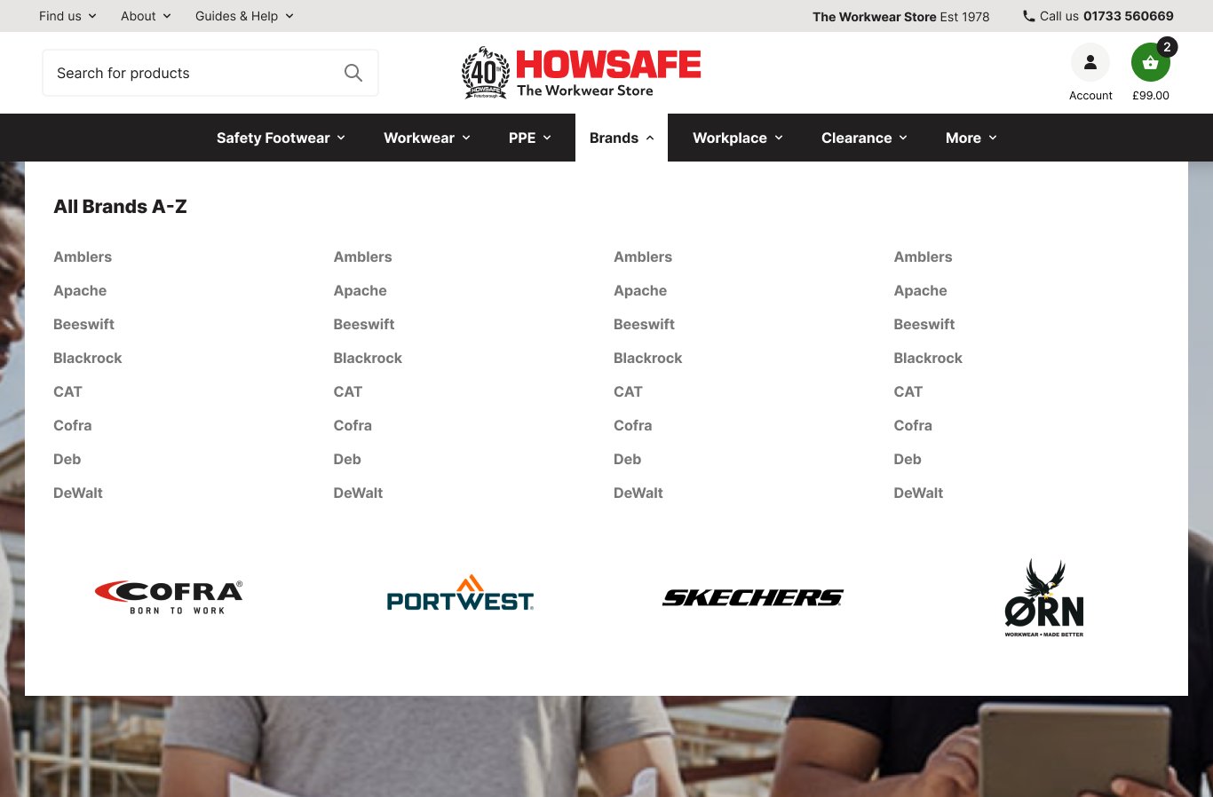
Brands was already a top-level link, but it sat outside the shop and took multiple clicks to reach. The redesign makes it a first-class navbar item with its own mega menu — you have 60+ brands and brand-led shopping is one of the strongest signals in your GA4 data.
Hero brand tiles for visual recognition, full A-Z text grid for buyers who already know the brand they want.
Workplace — two featured columns, supporting categories alongside.
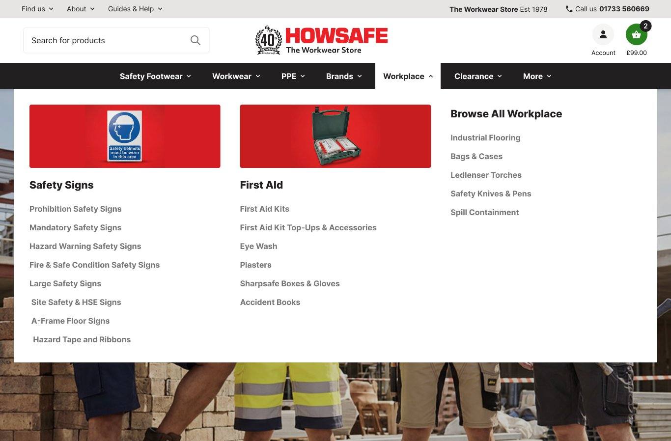
Safety Signs and First Aid have the most depth of sub-categories. Both get a featured photo with sub-cats inline. Five remaining workplace lines as a Browse All column.
Workplace categories aren't strongly brand-led — buyers shop by need (compliance, safety) not brand preference.
Compliance-driven purchases. Signs and First Aid are volume sellers; Industrial Flooring, Spill Containment serve specific job-site needs.
Clearance keeps prominence. More quietly demotes low-traffic categories.
Three landing destinations
Clearance Footwear, Stock Clearance, Special Offers — bargain hunters get a clear path. Promotional artwork carries the visual energy.
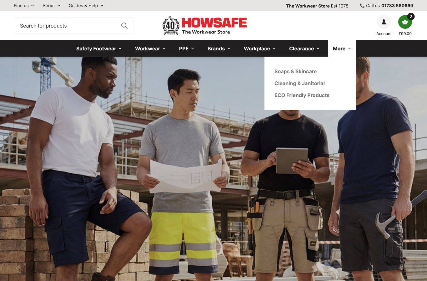
Skincare, Cleaning & Eco-Friendly move in here
All three were top-level categories competing for navbar real-estate, but the data doesn't support it — combined Skincare hub is 79 sessions in 90 days; Cleaning and Eco-Friendly aren't in the top 100. They keep a stable home in More. Reversible if any grow.